Why Your Webflow Site Looks Different After Publishing & How to Fix It
Written by
Andy Dao
,CEO
Published on:
August 15, 2025
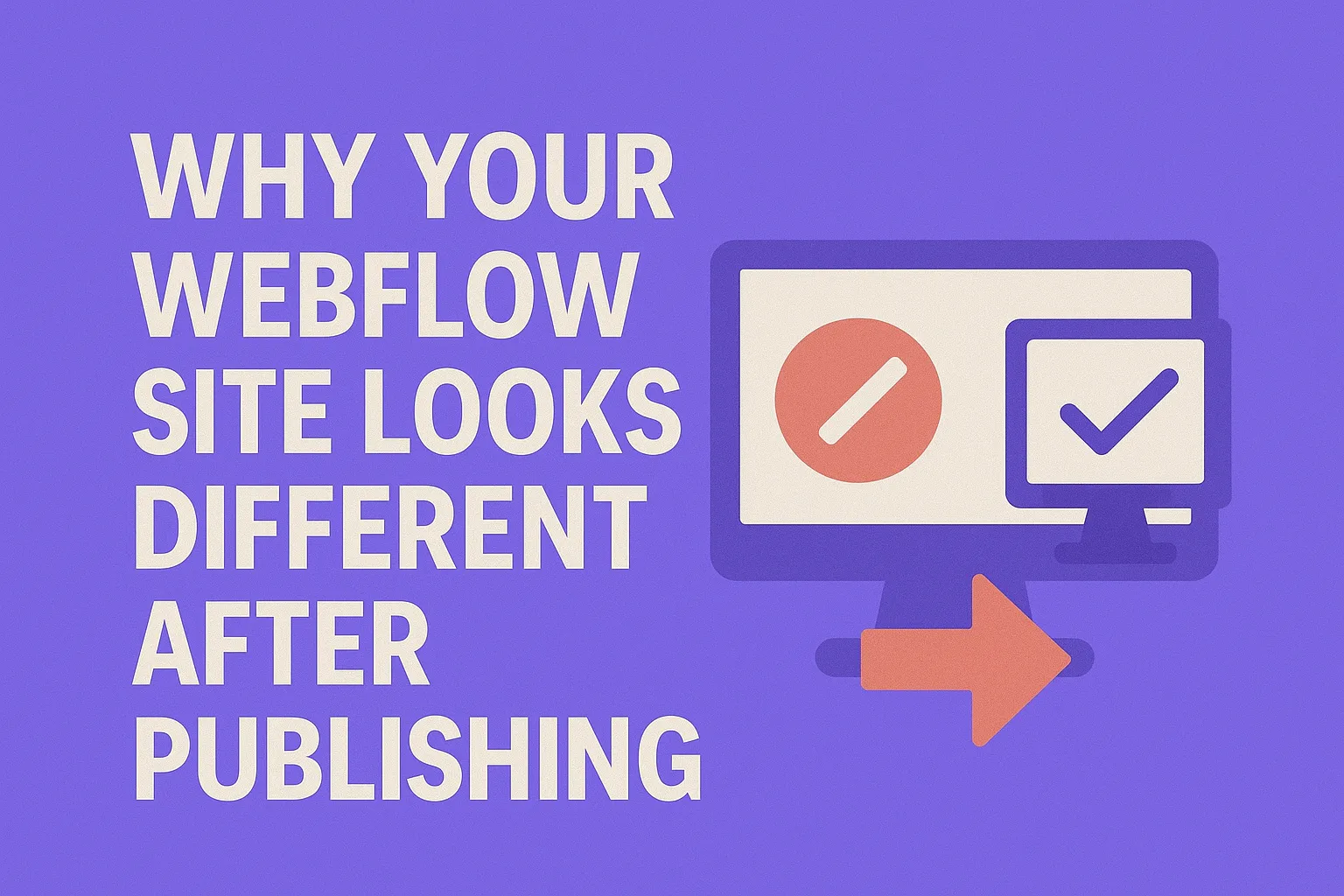
Why Your Webflow Site Looks Different After Publishing

Webflow Designer preview vs. published site: visual differences upon launch.
It’s frustrating: you craft a pixel-perfect design inside Webflow’s Designer, only to hit Publish and see discrepancies that leave you scratching your head. Fonts shift, layouts break, colors change, or animations stutter. This isn’t some rare glitch. In fact, many SaaS teams using Webflow struggle with their published site looking different than the Designer preview.
This discrepancy undermines brand trust and slows down product launches. But why does this happen? More importantly, how can you confidently fix it—without endless guesswork?
In this article, you’ll get a deep dive into the root causes of these Webflow publishing issues, backed by real user data and case studies. You’ll also walk through a precise, step-by-step troubleshooting workflow plus actionable fixes to make your published site match your design preview perfectly.
By the end, you’ll have a checklist to resolve and prevent these issues, ensuring your Webflow site launches exactly as intended across all devices and browsers.
Understanding Why Your Webflow Site Looks Different After Publishing
Difference Between Designer Preview and Published Site
The Webflow Designer preview operates in a controlled environment, optimized for editability and live updates. However, this runs locally on your machine, using Webflow’s internal rendering engine optimized for development—not the final user environment.
When you publish, your site is hosted through Webflow’s CDN with multiple layers of caching and asset optimization. Visitors' browsers, devices, and networks affect how the site loads and displays.
- Designer Preview: Instant updates, no cache, internal to Webflow’s system.
- Published Site: Served globally, subject to browser rendering differences, caching layers, and network latency.
This fundamental difference often leads to layout or style differences after publishing.
Common Causes of Visual Differences

Key contributors to design inconsistency when publishing with Webflow.
- Browser caching: Cached CSS, JS, or assets can prevent the latest updates from showing.
- Content Delivery Network (CDN): If your CDN (Cloudflare or Webflow’s default CDN) caches hard, viewers might see outdated versions.
- Responsive breakpoints: Overlapping or conflicting styles on different device widths cause unexpected shifts.
- Third-party scripts and embeds: External libraries or code snippets can introduce rendering delays or conflicts.
- Custom code: Unsafe or asynchronous scripts can override native Webflow styles or cause race conditions.
Real User Impact: Case Study Highlight
A SaaS startup using Webflow noticed their pricing page looked perfect in the Designer, but columns stacked incorrectly post-publish on mobile. Inspecting revealed third-party analytics scripts loading late, triggering CSS reflows. After disabling the script on that page and adjusting the breakpoint setup, layout consistency improved dramatically.
Takeaway: Visual differences can stem from multiple small issues stacking, not just Webflow itself.
Step-by-Step Process to Diagnose the Problem
1. Check Browser Compatibility and Device Emulation
Start by opening your published site in multiple browsers (Chrome, Firefox, Safari, Edge) and devices (desktop, tablet, mobile).
- Use Browser Developer Tools’ device mode to simulate popular viewport sizes.
- Compare your Designer preview screenshots with live screenshots to spot layout shifts.
- Tip: Pay special attention to font rendering and flexible grid behaviors.
2. Analyze Cache and CDN Influence
Webflow serves your site via a CDN, which aggressively caches assets to improve speed but can cause stale content.
- Force refresh your site (Ctrl+Shift+R or Cmd+Shift+R) to reload bypassing cache.
- Use online tools like WebPageTest to inspect cache headers and asset freshness.
- If you use third-party CDNs like Cloudflare, purge their cache manually via their dashboard.
3. Review Webflow’s Responsive Settings and Custom Code
- Examine styles applied specifically at each breakpoint inside the Designer.
- Look for unintended overrides: margins, padding, flexbox direction changes, or hidden elements.
- Audit custom code blocks and embedded scripts inside your page or project settings. Temporarily disable them and test.
4. Use Developer Tools for Visual Debugging

Browser developer tools help pinpoint visual discrepancies after publishing.
Open Chrome DevTools or Firefox Developer Tools to perform a detailed inspection:
- Check the Elements panel for overridden styles and computed properties that differ from Designer.
- Use the Network tab to verify that the latest CSS and JS files load correctly, with no 404s or delayed assets.
- Identify layout shifts with the Performance tab that records rendering and paint events.
5. Document Your Findings for Reproducibility
Keep a detailed log of:
- Devices and browsers tested
- Browser version numbers
- Steps to reproduce visual issues
- Which fixes temporarily or permanently resolved issues
This documentation helps communicate with Webflow support, your development team, or community forums.
Actionable Fixes to Make Your Published Site Match the Designer Preview
1. Clearing Cache and Cloudflare/Other CDN Purges
To resolve stale assets or styles:
- Hard refresh
- Clear Webflow’s default CDN cache: Republish your site.
- Clear third-party CDN caches: If using Cloudflare, log in and purge cache completely or by URL.
- Use cache-busting techniques: Rename asset files or query-string versions for CSS/JS changes.
2. Correcting Responsive Breakpoints and Viewport Settings
- Inside Webflow Designer, audit all breakpoints to ensure styles don’t conflict or cascade unexpectedly.
- Be wary of hiding elements or changing layouts only on one breakpoint without testing adjacent views.
- Verify your site's
<meta name="viewport">tag is correct in Project Settings—it should bewidth=device-width, initial-scale=1.
3. Managing Custom Code and Third-Party Scripts
- Audit all
<style>or<script>tags added via custom code sections. - Postpone script loading using
deferorasync, or load scripts only on specific pages. - Temporarily disable suspicious third-party integrations and verify if they cause layout shift.
- Use minimal, well-maintained libraries and avoid conflicting CSS frameworks.
4. Optimizing Asset Uploads and Formats
- Upload images in modern formats like WebP to reduce load times and prevent scaling issues.
- Ensure all icons, SVGs, and background images have consistent dimensions and aspect ratios.
- Compress assets without quality loss to prevent slow rendering triggering layout shifts.
5. Leveraging Webflow Support and Community Solutions
- Use Webflow’s official forums and support channels to report persistent bugs.
- Join Webflow-focused communities on Slack, Discord, or Reddit to share fixes and get peer input.
- Reference Webflow University tutorials on responsive design and custom code management for guidance.
Preventive Measures to Avoid Future Discrepancies

Testing and documentation: critical steps before launching your Webflow website.
Best Practices Before Publishing
- Test your site extensively on multiple devices and browsers before publishing.
- Use version control within Webflow to revert problematic changes.
- Document all custom code and third-party integrations.
Setting Up Staging Environments
Whenever possible, create separate Webflow projects or subdomains as staging environments for quality assurance. Test publishing there before pushing to production.
Regular Cross-Browser Testing
- Integrate cross-browser testing tools like BrowserStack or LambdaTest into your workflow for automated validation.
- Schedule periodic audits to catch issues caused by browser updates or new device launches.
FAQ: Troubleshooting Webflow Publishing Issues
Why does my Webflow site look different on mobile after publishing?
Mobile discrepancies often stem from unoptimized responsive breakpoints, conflicting CSS overrides on smaller screens, or viewport meta tag misconfiguration. Review your Webflow breakpoints, test on real devices, and ensure your viewport tag is set to width=device-width, initial-scale=1.
How can I fix Webflow layout shifts after publishing?
Layout shifts usually result from slow-loading assets, third-party scripts modifying DOM late, or inconsistent CSS loading. Fixes include optimizing images, deferring scripts, clearing caches, and ensuring no conflicting styles override your layout at runtime.
Does Webflow cache affect how my site appears?
Yes. Webflow’s CDN caches static assets like CSS, JS, and images to speed up delivery. However, this can cause outdated files to display after updates. Purge your cache by republishing, hard refresh browsers, or clearing external CDN caches if used.
What causes Webflow publishing errors?
Common publishing errors include:
- Cache/stale asset issues
- Conflicting custom code or broken third-party scripts
- Responsive breakpoint misconfiguration
- Incorrect project or page settings (e.g., SEO, viewport)
Systematically debugging these areas will resolve most publishing errors.
Conclusion & Actionable Takeaways
Understanding why your Webflow site looks different after publishing is key to maintaining a consistent, professional SaaS web presence.
Key takeaways:
- Designer preview ≠ Published environment: Expect differences, but fixable ones.
- Diagnose step-by-step: Check browser, cache, custom code, and breakpoints methodically.
- Clear caches regularly: Use hard refreshes and CDN purges after updates.
- Optimize responsive design: Test breakpoints and viewport settings meticulously.
- Audit custom code: Defer or disable problematic scripts to stabilize layouts.
- Prevent issues by testing: Use staging, version control, and cross-browser/device checks.
Use this checklist as your go-to guide whenever you face Webflow publishing discrepancies. Proactive monitoring and structured troubleshooting will keep your SaaS website polished, reliable, and trusted by users worldwide.
Unlimited Design & Webflow Development
Get unlimited design & development requests for a flat monthly rate. Fast turnaround without compromising on quality. No contracts or surprises. Cancel anytime.