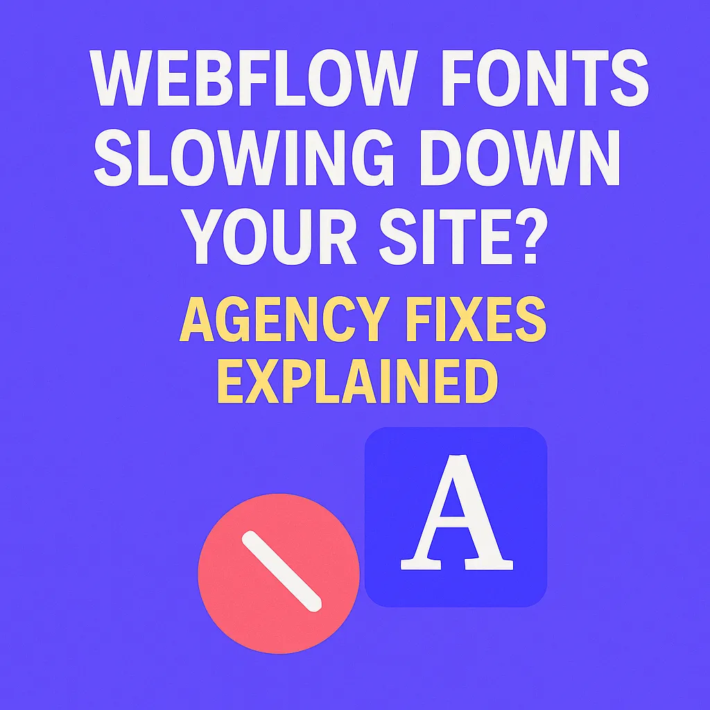
Webflow Fonts Slowing Down Your Site? Agency Fixes Explained
Written by
Andy Dao
,CEO
Published on:
August 21, 2025
Is Your Webflow Site Being Dragged Down by Fonts?
If your Webflow site feels sluggish—pages hesitate before loading, or sections jump as fonts appear—your typography could be secretly sabotaging you.
Webfonts are some of the biggest, most overlooked culprits behind slower site speeds, poor Core Web Vitals scores, and lost conversions. For SaaS agencies and marketers who demand digital agility, every second counts: slow font delivery silently kills first impressions and bleeds revenue.
The good news? Webflow font optimization isn’t just for developers—it’s fully within your control. This guide exposes the hidden performance impact of webfonts, unpacks exactly why Webflow fonts are slowing everything down, and gives agency-grade fixes you can deploy today.

image showing fonts as the performance bottleneck.
Why Webflow Font Performance Matters
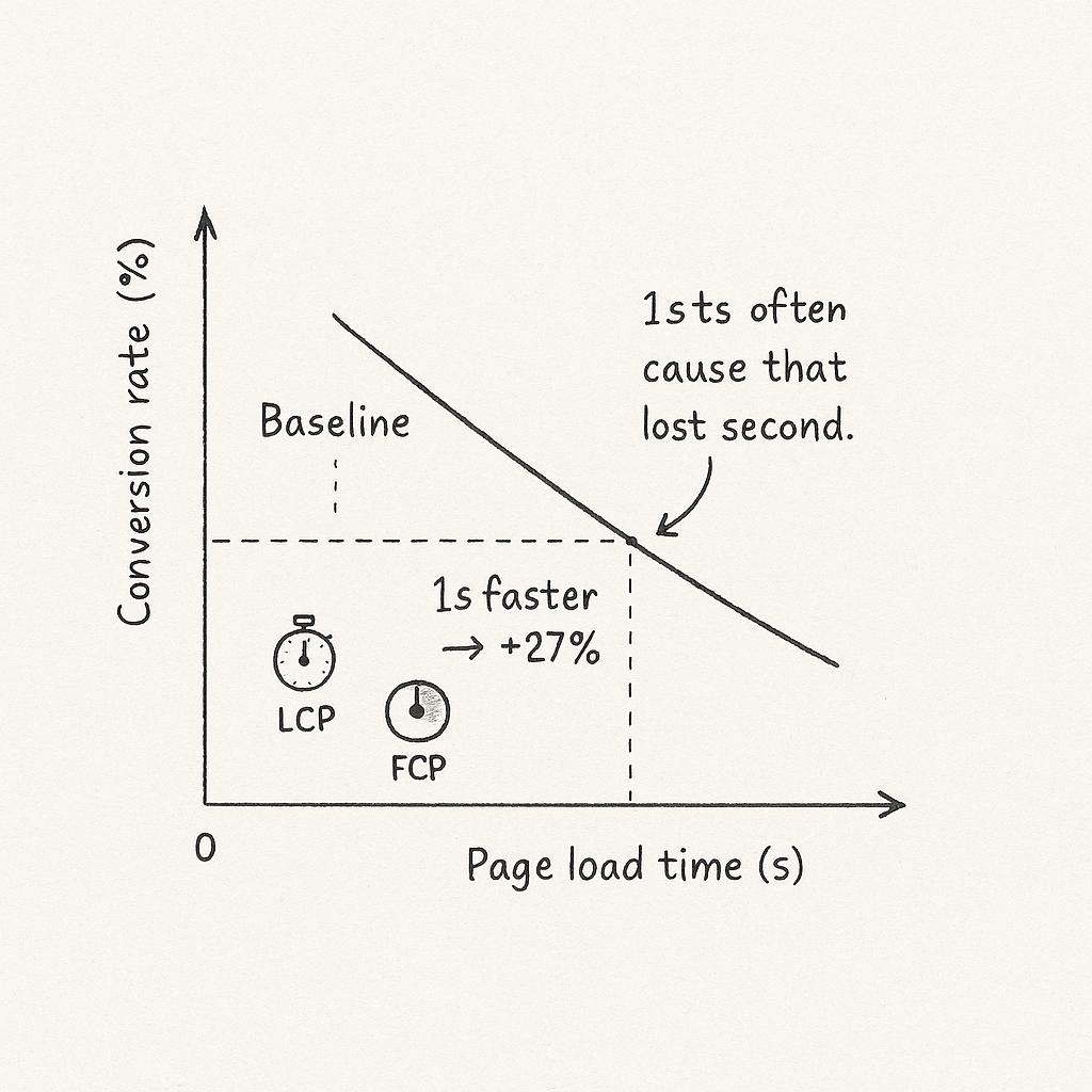
A snappy website doesn’t just look good—it converts better. Google’s research shows that a site loading one second faster can boost conversion rates by up to 27% (source). Fonts are a leading—and preventable—factor in page delays, especially for agencies shipping dozens of high-design client sites.
Style: flat isometric infographic in the same modern SaaS palette (blues/teals) with minimal text — visualizing the conversion impact of shaving seconds off load time.
Here’s how fonts affect your bottom line, every time:
- Core Web Vitals: Webfont files are often render-blocking, hurting your Largest Contentful Paint (LCP) and First Contentful Paint (FCP) scores—critical to Google rankings.
- User Experience: Slow fonts cause "flash of invisible text" (FOIT) or "flash of unstyled text" (FOUT), confusing visitors and increasing bounce rates.
- Conversion Rates: 53% of visitors abandon sites that take over 3 seconds to load. Fonts are usually at the top of the waterfall chart.
Real-World Impact: Font Optimization in Action
Consider FinTech agency Blueleaf, who shrank their homepage load time by 900ms by auditing and subsetting their Webflow fonts. Conversion rates jumped 16%—just from font optimization. Another SaaS startup, Curri, improved their mobile Lighthouse score from 58 to 93 by self-hosting only essential font weights.
Bottom line: Font performance is a key leverage point. If you want fast, modern SaaS sites, optimizing fonts is non-negotiable.
Pinpointing the Problem: How Fonts Slow Down Your Webflow Site
To fix sluggish Webflow projects, you need to trace exactly how webfonts slow things down. For agencies, speed audits almost always start with the font stack.
Why Fonts Hurt Performance
- Render-Blocking: Webfont files are “render-blocking resources”—browsers won’t draw text until fonts download, stalling First Contentful Paint (FCP).
- Excess Requests: Each font weight, style, or family adds an extra HTTP request. Extra variants multiply page delays.
- File Size: Unoptimized fonts can be 300KB+ per file. Loading unused weights means dead weight on every page.
How to Diagnose Font Issues in Webflow
- Google Lighthouse Audits: Run a Lighthouse report in Chrome DevTools. Look for the "Reduce render-blocking resources" warning—fonts are usually listed first.
-
Webflow Designer Audit Panel:
- Open your project in Webflow Designer.
- Click the Audit tab (top right; looks like a heartbeat).
- Warnings like "Unused font weight" or "Excessive font files loaded" flag issues instantly.
-
Network Waterfall (Chrome DevTools): Check the Network tab for
.woff/.woff2files—note total size and load order.
- Lighthouse: "Eliminate render-blocking resources"
- Webflow Audit: "Unused font variant", "Font file too large"
- Network: Font files loaded before content

a simplified waterfall highlighting font files as render-blocking.
If you see these errors, your fonts are slowing your Webflow site down.
Common Webflow Font Pitfalls Agencies Encounter
Most Webflow performance headaches trace back to a handful of common font mistakes. Here’s what agencies trip over—and what it’s costing your projects.
Top Font Mistakes in Webflow
- Too Many Weights & Families: Designing with five font families and 12 weights bloats your load time. Each variant is its own file—multiplying requests.
- Importing Oversized or Unused Files: Uploading the entire font library (instead of only what’s used) dramatically increases initial page payload.
- Google Fonts Defaults Only: Relying on default Google Fonts settings in Webflow loads full character sets and all styles, not just what you need. This is a silent performance killer.
- Not Compressing or Subsetting: Most agencies don’t subset (only include needed characters/scripts). You end up serving huge Unicode blocks for a simple SaaS marketing page.
How Font File Size Impacts Speed
| Font Scenario | # of Requests | Total File Size | Impact on LCP |
|---|---|---|---|
| 3 families x 5 weights | 15 | ~1.8 MB | Major slowdown |
| 1 family x 2 weights (subset) | 2 | ~90 KB | Fast—sub-second LCP |
| Default Google Fonts (all styles) | 6 | ~600 KB | Moderate; avoid for critical text |
Step-by-Step: How Agencies Optimize Fonts in Webflow
Ready to solve Webflow font performance issues in your project? Here’s the exact agency workflow—from audit to implementation—using best-in-class techniques and Webflow’s own tools.
Step 1: Audit Your Current Font Usage
-
Open Webflow Designer and view your project’s Fonts panel.
Check each font family, weight, and style applied in Styles and Typography settings. - Run a Lighthouse or PageSpeed Insights test. Document which font files load, their sizes, and which are render-blocking.
-
In Webflow’s Audit tab, review for:
- “Unused font variant loaded”
- “Excessive font files”
- Map all fonts used across your project. Note which families/weights/styles are actually styled on published pages.
Step 2: Eliminate Unused Weights and Styles
- In Webflow Designer, remove any font family, weight, or style not applied to live elements.
- If using Google Fonts integration: In Project Settings > Fonts, uncheck unused weights/styles for each family—or delete the family if not required.
- If uploading custom fonts: Only upload specific
.woff2files in used weights/styles. Avoid.ttfor entire font suites. - Re-publish and re-test with Lighthouse/PageSpeed. Note size and request reduction.
Step 3: Apply font-display: swap for Faster Rendering
-
For Google Fonts or custom CSS, ensure
font-display: swapis declared in the@font-faceCSS block. This tells browsers to show system fonts until your webfont loads (eliminates invisible text). -
For Google Fonts embed, add
&display=swapat the end of the URL. Example:https://fonts.googleapis.com/css?family=Inter:wght@400;700&display=swap -
Webflow’s Google Fonts integration automatically adds
swapfor recent projects, but check withView Page Sourceif you’re unsure.
font-display: swap, browsers wait for fonts—causing visible blank spots or layout shifts.
Step 4: Self-Host Critical Fonts for More Control
-
Download the exact font weights/styles you use in
.woff2format (from Google Fonts, Font Squirrel, or the foundry). - Compress the font files with Transfonter or Glyphhanger.
- Upload your
.woff2files in Webflow Project Settings > Fonts > Upload. -
Define your
@font-facein Project Settings > Custom Code or within the<head>of your site:@font-face { font-family: 'YourFont'; src: url('fonts/yourfont.woff2') format('woff2'); font-weight: 400; font-display: swap; } -
Apply font-family in your project Styles as needed and publish.
Key benefit: No more relying on Google’s CDN—lower latency and tighter control.
Step 5: Compress and Subset Fonts to Minimize File Size
-
Compress fonts with Transfonter or Glyphhanger. Always use
.woff2—it’s 30–50% smaller than.woffor.ttf. -
Subset to only include used characters/script:
- Most SaaS sites only need basic Latin (A–Z, 0–9, punctuation).
- Remove extended language support if not required.
- Check size: Aim for under 40KB per font file for above-the-fold text.
Step 6: Lazy-Load or Defer Non-Critical Fonts
-
For non-essential fonts (e.g., those used below the fold or on modals), load them after content paints. Use
rel="preload"withas="font"for above-the-fold, and defer others via JS or font face observer if needed. -
Example – Preload critical font:
<link rel="preload" href="/fonts/yourfont.woff2" as="font" type="font/woff2" crossorigin> - Advanced: Lazy-load non-critical fonts with the Font Face Observer JS library.
Data Callout: Average Load Time Savings for Each Step
| Optimization Step | Avg Load Time Saved |
|---|---|
| Remove unused weights/styles | 200–600ms |
| Apply font-display: swap | Instant FCP; eliminates FOIT/FOUT |
| Self-host compressed, subset font | 300–900ms |
| Lazy-load/defer non-essential fonts | 200–400ms |
Bonus: Advanced Pro Moves Agencies Use
Variable Fonts: Fewer Files, Same Flexibility
- Variable fonts combine every weight and style in a single file—reducing requests from 6–12 down to one. Many modern SaaS brands now use only a single variable font on production.
-
Available via Google Fonts and many premium foundries. Ensure
font-variation-settingsare supported in your styles. - Result: Single 70KB file replaces 400–800KB in multiple weights.
Preloading Key Font Files
-
Preload your primary text font(s) in the
<head>to ensure above-the-fold text paints instantly.
<link rel="preload" href="/fonts/yourfont-regular.woff2" as="font" type="font/woff2" crossorigin> - Target only primary weights used in headers and body.
Adobe Fonts x Webflow: Optimized Integrations
-
Agencies using Adobe Fonts: In
Project Settings > Fonts > Adobe Fonts, paste your Project ID. - Adobe is fast, but still loads all variants in your kit by default. Remove unused weights and styles from the kit in your Adobe Fonts dashboard.
-
Tip: Pair with
font-display: swapin your CSS for best-in-class performance.
Measuring Results: Font Optimization Impact
After you’ve optimized your Webflow site fonts, validate results.
Before/After: Waterfall Comparison

Style: flat isometric side-by-side comparison panels in the same SaaS palette — clear before/after visualization for audit reporting.
Key Results (Every Agency Should See):
- Largest Contentful Paint (LCP): Improved by 500ms–1.5s
- First Contentful Paint (FCP): Near-instant (100–300ms improvement)
- Bounce Rate: Drops as visitors see content fast, not blank screens
- Core Web Vitals: Greener across the board—higher rankings, better conversions
FAQs: Webflow Font Performance
Why is my Webflow site still slow after reducing images?
Images are only part of the load equation. Fonts often come before images in the waterfall, especially if you’re using multiple families or heavy Google Fonts defaults. Even with tiny images, unoptimized fonts will drag your speed scores down. Always audit fonts whenever site speed is an issue.
How do I check which fonts are actually loading?
- Open Chrome DevTools “Network” tab, filter by
fontor look for.woff2/.wofffiles. - Run Google PageSpeed Insights or Lighthouse: look in the “Reduce render-blocking resources” and “Serve static assets with an efficient cache policy” sections for all fonts loaded.
- In Webflow Designer, the Audit tab will call out unused loaded fonts and variants.
Can I use custom fonts without hurting speed?
Yes—if you compress, subset, and self-host only the weights/styles you use. Avoid uploading huge font packages or leaving Google Fonts on default. Use font-display: swap for improved FCP and preload only critical font files.
What’s the best tool to monitor Webflow font performance?
- Google Lighthouse/PageSpeed Insights: For Core Web Vitals and render-blocking audits
- WebPageTest.org: For network waterfall/sequence clarity
- Chrome DevTools Network Tab: For real bytes/requests review
- Webflow Designer Audit Panel: For in-app font usage warnings
How do agencies decide which fonts to keep?
- Aim for 1–2 families maximum (brand and accent fonts)
- Use only 1–2 weights per family unless truly needed
- Subset out italics/bolds unless they’re used on live site
- Prioritize above-the-fold fonts: optimize these first
Recap & Action Checklist: Font Optimization for Webflow Agencies
Sluggish SaaS sites and agency builds often trace back to fonts—not images or scripts. Here’s your no-fluff checklist for Webflow font optimization for agencies:
- Audit all fonts, weights, and styles actively in use (Designer, Lighthouse, DevTools)
- Remove unused families, weights, and variants everywhere
- Switch Google Fonts embeds to only load what you use (or self-host via .woff2)
- Compress and subset fonts for your character set; use
.woff2only - Apply
font-display: swapand preload above-the-fold fonts - Lazy-load or defer any non-critical fonts (modals, below-the-fold, etc.)
- Test before/after with Lighthouse, WebPageTest, and Webflow’s Audit panel
- Monitor Core Web Vitals scores after publishing
Conclusion: Give Your Webflow Project a Performance Makeover
Don’t let fonts bottleneck your next SaaS launch or client site. Font speed is a true hidden lever for better Core Web Vitals, higher conversion rates, and lower bounce. Start auditing, subsetting, and preloading your typography—and give your Webflow project the fast, modern foundation users expect.
You control your font performance. Make every millisecond count.
Unlimited Design & Webflow Development
Get unlimited design & development requests for a flat monthly rate. Fast turnaround without compromising on quality. No contracts or surprises. Cancel anytime.