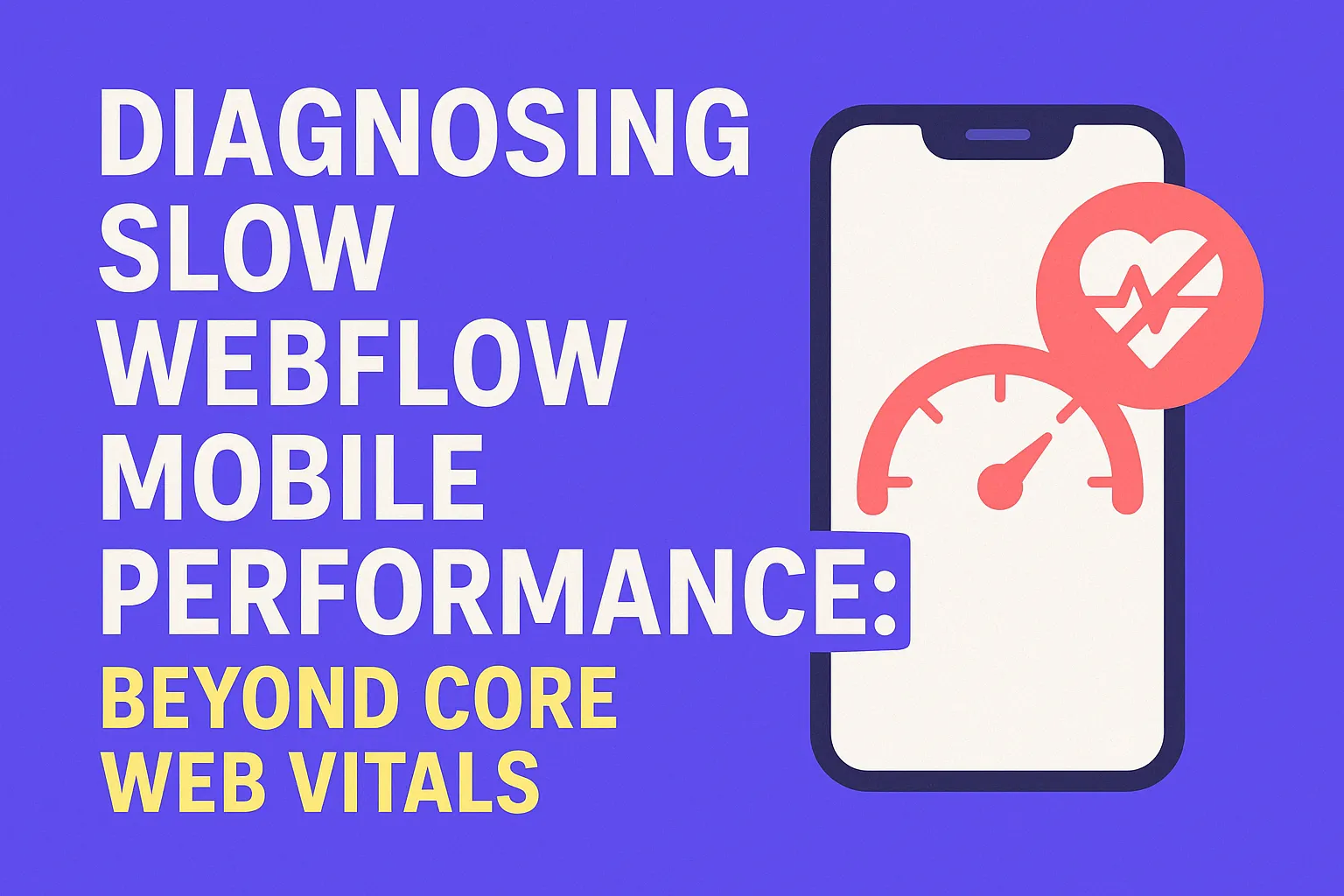
Diagnosing Slow Webflow Mobile Performance: Beyond Core Web Vitals
Written by
Andy Dao
,CEO
Published on:
August 18, 2025
Why Your Webflow Mobile Site Feels Slow — Even With 'Good' Core Web Vitals
You log into your analytics and see a familiar story: your Webflow site looks flawless on desktop—snappy loads, high engagement, and Core Web Vitals in the green. But then you grab your phone. Suddenly, taps lag, images hang, menus stutter, and visitors bounce before your headline can load.

Why mobile can feel slow even when lab metrics look good.
This isn’t just you. Many SaaS teams see excellent Core Web Vitals scores in Lighthouse or Google Search Console, yet real users complain—mobile feels slow, clunky, or unpolished. Even worse, conversion rates drop fast on mobile, where most of your prospects engage first.
So what gives? The paradox: Core Web Vitals often miss the real bottlenecks impacting mobile experience, especially on modern Webflow sites. In this guide, you’ll learn the hidden causes of Webflow mobile slowness and get a proven roadmap to diagnose, fix, and optimize your mobile site for real users—not just synthetic tests.
What Core Web Vitals Actually Measure (and What They Miss on Mobile)
Google’s Core Web Vitals are the go-to metrics for judging site performance. They focus on how users perceive load experience, interaction, and visual stability. But what do they really track—and where do they fall short, especially for mobile?
Core Web Vitals include:
- Largest Contentful Paint (LCP): When the biggest visual element loads
- First Input Delay (FID): Delay before site responds to first tap/click
- Cumulative Layout Shift (CLS): Visual content jumping during load
On mobile, these matter—but only scratch the surface. Here’s why:
- CWV doesn’t always account for real-world network latency or heavy resource loading after the page appears.
- Some bottlenecks—like main thread blocking or unoptimized touch events—don’t show up in CWV metrics.
| Core Web Vital | What It Captures | What It Misses (Mobile) |
|---|---|---|
| LCP | Time until main content appears | Heavy scripts/images loaded after LCP, skeleton loaders that mask true delay |
| FID | Delay responding to first user input | Slow interactions after page load, JS event blocking |
| CLS | Visual element stability | Delayed layout shifts, UI jank during interaction |

What CWV measures vs. the mobile issues they miss.
Hidden Performance Gaps in Webflow Mobile Sites
Your Core Web Vitals score may say “all clear,” but real mobile users still feel the lag. Why?
What Core Web Vitals Don’t Catch: The Overlooked Mobile Bottlenecks
- 3rd-Party Scripts: Chat widgets, analytics, and A/B testing tools often load after LCP—slowing down actual usage without touching your CWV score.
- Inefficient JS Interactions: Desktop-optimized code can bog down mobile CPUs, making touch and scroll feel unresponsive.
- Resource Bloat: Unoptimized images, web fonts, or unused CSS loaded for every screen—even if they’re never seen on mobile.
- Expensive Animations or Effects: Large libraries (e.g., Lottie, Swiper, GSAP) intended for desktop splash don’t translate well to mobile.
Case Study: Impact of Heavy JavaScript on Mobile Webflow
Consider a SaaS landing page built in Webflow:
- Initial mobile load: 2.1 MB JS, 30+ network requests
- TTI (Time to Interactive): 5+ seconds on 3G
After cutting unused scripts and optimizing image delivery:
- JS payload: under 950 KB
- TTI: 2.2 seconds on 3G
Result: User engagement jumped 16%, mobile bounce dropped by 30%—even though Core Web Vitals scores barely changed.
A waterfall chart in Chrome DevTools shows a dozen non-critical scripts blocking the main thread after LCP. Most users experience this as laggy scrolling or janky menus—yet CWV stays “good.”

Simplified waterfall: non-critical scripts block interaction after LCP.
Key Hidden Causes of Webflow Mobile Lag
- 3rd-party tracking loading on every page
- Multiple web font weights, heavy hero images (not sized for mobile)
- Custom interaction scripts running on all breakpoints
- Webflow’s built-in code (e.g., interactions.js) adding unused scripts
Advanced Diagnostics Beyond Core Web Vitals
If you’re serious about diagnosing slow mobile performance on Webflow, you need to dig deeper than Google’s surface-level metrics. Here’s how top SaaS teams use real tools to pinpoint what’s weighing down mobile experience—and how you can too.
Step-by-Step: Using Chrome DevTools for Mobile Performance Analysis
- Open Chrome DevTools. Right-click your site in Chrome > Inspect > Toggle Device Toolbar (Ctrl+Shift+M).
- Set a mobile device profile (e.g., iPhone X, Moto G4) and throttle to “Slow 3G” or “Fast 3G.” This is critical—real mobile users aren’t on fiber.
- Navigate to the Performance tab. Start recording, then reload your page.
- Analyze the waterfall:
- Look for long purple (scripting) or orange (rendering) blocks on the main thread. These signal JS or CSS operations blocking interactivity.
- Note oversized images, fonts, or libraries loaded before interaction is possible.
- Switch to the “Network” tab: Sort requests by size and “Initiator” to spot non-critical 3rd-party scripts or images delaying your main content.
Pinpointing the Real Culprits: Beyond LCP, FID, CLS
The critical metrics for webflow mobile performance issues frequently include:
- Time to Interactive (TTI): When the page is fully usable—not just when main content loads
- Total Blocking Time (TBT): How much main-thread time is eaten up by scripts after load
- Scripting Bottlenecks: Functions or libraries blocking taps, hovers, scroll
- Long Tasks: Any task taking >50ms (usually JS events, parsing, rendering)
| Metric | What to Look For | Optimal Value (Mobile) |
|---|---|---|
| TTI | Usable navigation, buttons work, content scrolls | <2.5 s |
| TBT | Main thread time spent blocked by scripts | <150 ms |
| Long Tasks | Scripting/rendering tasks over 50 ms | Few to none |
Semantic Chunk: Analyze What Users Actually Do
- Trigger your most common mobile flows: opening menus, submitting forms, scrolling through testimonials.
- Watch for UI elements that freeze, stutter, or delay.
- Correlate these pain points in DevTools’ timeline with script/network requests. This is the goldmine for how to improve Webflow mobile performance.
Actionable Fixes for Overlooked Mobile Bottlenecks
Now, let’s turn diagnosis into action. Here’s how to solve webflow mobile speed optimization problems with the highest ROI for SaaS sites—without a deep developer background.
1. Prioritize and Reduce Third-Party Scripts
- A/B Test Scripts: Only load on conversion-critical pages; defer or lazy-load elsewhere.
- Marketing Widgets: Remove or replace heavy widgets (chatbots, pop-ups) with lightweight alternatives on mobile.
- Best practice: Tag each 3rd-party in GTM/Head code. Periodically audit by turning each off, measuring TTI impact, and only keeping those with measurable ROI.
2. Lazy Load Non-Critical Resources
- Images below-the-fold: Use Webflow’s built-in “lazy load” for every Image element not visible immediately.
- Videos, iframes, embeds: Swap with static previews. Load dynamic content only on tap.
- Non-essential fonts: Use “font-display: swap” or favor system/default fonts for mobile.
3. Optimize Touch Interactions (Event Delegation, Debouncing)
- Event Delegation: Process similar events higher in the DOM (e.g.,
onclickfor menu parents), not every child element. - Debounce Tap/Scroll: Use debouncing/throttling to limit how often heavy handlers fire on touch events.
- Disable hover animations for mobile; these often cause repaints and lag on touch screens.
4. Reduce Webflow’s Built-in JS/CSS Where Possible
- Delete unused Interactions, sliders, tabs, and lightboxes.
- Minimize use of multiple combo classes/nested elements that bloat published CSS/JS.
- If using custom code, load only on relevant pages (e.g., no
<script>sitewide if it powers just one landing page). - Remove jQuery unless absolutely needed—modern vanilla JS covers most interaction needs.
| Before Optimization | After Optimization | |
|---|---|---|
| Total JS Payload | 2.1 MB | 900 KB |
| Largest Contentful Paint | 2.2 s | 1.5 s |
| Time to Interactive | 5.2 s | 2.1 s |
| Total Blocking Time | 870 ms | 150 ms |
| Bounce Rate (Mobile) | 64% | 42% |

Before vs. after: real UX gains from cutting scripts and optimizing assets.
5. Ongoing Maintenance: Oust Bloat Regularly
- Set a recurring reminder (every 3 months) to audit all custom embeds, scripts, and widgets.
- Monitor and A/B test any new integrations—especially for marketing, analytics, or lead capture—on mobile speeds before deploying to production.
Measuring Real User Experience (RUM) for Webflow Mobile
It’s one thing to ace lab tests. Real improvement means tracking field data from actual mobile users—across their devices, networks, and journeys.
How to Implement Real User Monitoring (RUM)
- SpeedCurve: Tracks your Webflow performance for real users, including “Mobile Experience Index.”
- Lighthouse CI: Automate mobile performance audits every deploy. See trends over time, not just one-off snapshots.
- Google Analytics + Custom Events: Track tap/scroll lag, rage clicks, or time-to-first-interaction on key flows.
Lab: Lighthouse, Chrome’s audits, WebPageTest—controlled device, network.
Field: Real users, real devices, fluctuating networks, actual journeys. Use both!
User Journey Mapping for Mobile
- Identify your top 3-5 mobile paths (sign up, pricing, product tour, support).
- Map critical interactions: navigation, form submit, menu open, scroll through testimonials.
- Monitor where users bail or struggle. These are “slow points” to fix.
- Add custom analytics events or RUM tagging to measure delays and user frustration—not just LCP/FID.
FAQs: Diagnosing & Fixing Slow Mobile on Webflow
Why does my CWV score look fine, but my site feels slow on mobile?
Core Web Vitals measure only surface-level page load milestones (like when the largest image appears). They miss lag from heavy 3rd-party scripts, slow touch responses, or JS/CSS that blocks smooth interaction after the content has loaded.
Can I fix mobile slowness in Webflow without hiring a dev?
Absolutely. Many wins come from Webflow’s built-in settings: delete extra Interactions, reduce page elements, enable image lazy loading, and audit your custom code blocks. For deeper issues, you’ll need to profile with a tool like Chrome DevTools, which is accessible to non-developers with a bit of practice.
What are quick wins for improving Webflow mobile performance?
- Remove/defer chat widgets or non-essential pop-ups on mobile
- Enable lazy loading for images
- Limit font weights/styles (use only 1–2 for mobile)
- Reduce complex Interactions/Animations to only what’s necessary on mobile
How do third-party widgets impact mobile speed?
Most 3rd-party scripts load after main content—but often block user interaction, cause layout jank, or add delays to menus/taps. On mobile, even “non-critical” widgets can eat up 1-2 seconds of interactivity. Always load these scripts conditionally and review their impact monthly in analytics and audits.
Should I use web fonts or system fonts on mobile?
System fonts are best for performance: zero downloads and immediate rendering. If your brand requires a custom font, load just a single weight/style and use “font-display: swap” to minimize delays. Every 100 KB matters on mobile—web fonts can easily add .5s+ to “time to readable text.”
Conclusion: Go Beyond Core Web Vitals to Deliver Real Mobile Speed
Core Web Vitals aren’t the finish line for Webflow mobile optimization—they’re just the start. To truly solve diagnosing slow mobile performance on Webflow, SaaS teams must profile actual user interactions, audit every third-party, streamline assets, and measure improvements with real user data.
- Profile mobile site with Chrome DevTools on slow network/device profile
- Remove or defer all non-critical 3rd-party scripts (widgets, chat, A/B testing)
- Enable lazy loading for all images and embeds below the fold
- Condense Interactions & Animations to only what’s needed per breakpoint
- Minimize JS/CSS payload using custom code audits and code splitting
- Monitor field data with SpeedCurve or Lighthouse CI plus custom events
- Iterate: re-audit, test journeys, and compare bounce/conversion rates after each change
Unlimited Design & Webflow Development
Get unlimited design & development requests for a flat monthly rate. Fast turnaround without compromising on quality. No contracts or surprises. Cancel anytime.