B2B SaaS Pricing Page Mistakes That Cost 40% of Sign-Ups | Optimize Now
Written by
Andy Dao
,CEO
Published on:
August 15, 2025

Introduction
Did you know your B2B SaaS pricing page mistakes can cost you over 40% of potential sign-ups? Many SaaS marketers struggle with pricing clarity, confusing plan options, and trust issues that lead to hesitation and drop-offs. If your pricing page isn’t perfectly crafted, prospects won’t convert—even if your product is excellent.
This guide dives deep into the most costly B2B SaaS pricing page mistakes that cost sign-ups and outlines actionable fixes that boost clarity, trust, and conversions. Whether you wonder why your sign-ups stagnate or how to fix SaaS pricing page problems, you’ll find clear, research-backed strategies for effective SaaS plan presentation and pricing page conversion optimization.
By the end, you’ll know exactly how to redesign your pricing page for maximum impact — from simplifying plans to using pricing psychology techniques that steer decision-making. It’s time to stop losing customers before they sign up.
Why Your SaaS Pricing Page Matters

A well-designed SaaS pricing page is a crucial conversion driver.
The pricing page is not just a formality or afterthought — it’s a critical stage in your sales funnel. Buyers spend significant time on this page because price is often the decisive factor in SaaS purchasing decisions.
According to research, clear and transparent pricing pages increase sign-up rates by up to 30%. In contrast, confusing or cluttered pricing pages push prospects away, leading to high abandonment rates.
Pricing Page's Role in the Buyer Journey
- Anchor point for decision-making: Pricing validates your product’s value versus cost.
- Filters serious buyers: Helps qualified leads self-select appropriate plans.
- Reduces friction: Clear information cuts hesitation and cognitive overload.
Case Study: The Power of Clarity
A SaaS platform with a cluttered pricing page saw a conversion rate of 8%. After simplifying plan options and clarifying feature differences, their sign-up rate soared to 13%. That’s a 62% lift driven solely by better pricing page UX.
Key takeaway: The pricing page is a conversion powerhouse when designed with buyer psychology and clarity in mind.
Top 7 Pricing Page Mistakes Costing You 40%+ Sign-ups
Mistake 1: Overwhelming Number of Plans

Reducing the number of visible plans clarifies choices and increases conversions.
Offering too many pricing plans paralyzes your prospects. UX studies show that people can comfortably compare 3-4 options, but more than that leads to confusion and decision fatigue.
- Effect: Users stall or leave without signing up.
- Stat: Hick's Law demonstrates decision time increases exponentially with option count.
Suggested Fix: Simplify to 3 clear plans: Basic, Pro, and Premium. This encourages faster decisions and easier plan differentiation.
Mistake 2: Lack of Pricing Transparency
Hidden fees, vague terms, or “contact us for pricing” options erode trust instantly. Prospects want all costs visible upfront to avoid unpleasant surprises.
- Effect: Increased bounce rates and lost trust.
- Data: 70% of SaaS buyers abandon when pricing is unclear.
Suggested Fix: Show total monthly/annual costs clearly. Include any add-on fees or setup charges in plain sight.
Mistake 3: No Clear Value Differentiation
When plan features blur together, buyers hesitate. Without obvious reasons to pick a middle or premium tier, many default to the cheapest or leave.
- Effect: Pricing friction and lost average revenue per user (ARPU).
- Research: Feature comparison tables improve clarity and drive higher-tier sales.
Suggested Fix: Use a clear feature comparison table highlighting best value plans. Bold key differentiators and benefits.
Mistake 4: Missing Social Proof on Pricing Page
Pricing pages often lack testimonials or trusted customer logos — a missed opportunity to validate your value.
- Impact: Lower confidence and higher friction.
- Stat: Pricing pages with social proof see up to 20% higher conversions.
Suggested Fix: Place client logos, review excerpts, or quick testimonials near CTAs to reinforce trust.
Mistake 5: Poor CTA Placement and Copy
Weak, non-actionable CTAs or CTAs hidden below the fold kill conversions.
- Effect: Users don’t know what to do next or give up midway.
- Best practice: Use bold, contrasting buttons with action verbs like “Start Free Trial” or “Get Started Now.”
Suggested Fix: Place CTAs repeatedly — above the fold, beside plans, and at the page bottom.
Mistake 6: Not Optimizing for Mobile
Mobile traffic now constitutes over 50% of website visits. A non-responsive pricing page frustrates users with hard-to-read tables and buttons.
- Stat: Mobile-unfriendly pages suffer 30-50% lower conversion rates.
- Impact: Lost sign-ups from fast-scrolling mobile users.
Suggested Fix: Use responsive design, stack pricing plans vertically, and ensure CTAs are thumb-friendly.
Mistake 7: Ignoring Price Anchoring and Psychological Pricing Principles
Price isn’t just numbers; it’s a perception game influenced by behavioral economics.
- Price anchoring: Presenting a high-priced tier first makes other plans look affordable.
- Charm pricing: Ending prices with .99 or .95 significantly increase purchase intent.
- Decoy effect: Adding a clearly inferior mid-tier can push buyers to the preferred premium plan.
Suggested Fix: Apply pricing psychology: anchor high first, use charm pricing, and strategically position the best-value plan.
Step-by-Step Guide to Optimizing Your SaaS Pricing Page

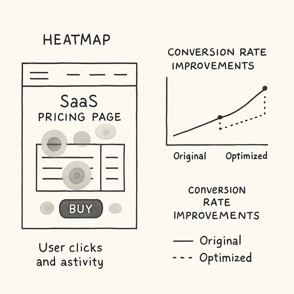
Heatmaps and A/B test data reveal where pricing page optimizations drive more sign-ups.
Step 1: Analyze Current User Behavior
Use tools like Hotjar or Crazy Egg to generate heatmaps and session recordings. Focus on:
- Where users click/navigate.
- How far they scroll.
- Places where they hesitate or bounce.
This data reveals hidden friction points on your pricing page.
Step 2: Run Focused A/B Tests
Test key elements independently to isolate impact:
- Number of pricing plans (3 vs 4+).
- CTA button text and color.
- Visibility and clarity of pricing details.
Track conversions, bounce rates, and session duration to identify winning variants.
Step 3: Implement Trust Boosters
Add elements proven to assuage buyer apprehension:
- FAQs: Address common pricing and feature concerns.
- Money-back guarantees: Shift risk perception.
- Customer testimonials and logos: Build credibility.
Step 4: Optimize for Mobile and Page Speed
Ensure your pricing page loads fast and displays perfectly on all screen sizes:
- Minimize image size and scripts.
- Stack pricing plans vertically on mobile.
- Use large, tappable CTAs with sufficient spacing.
Step 5: Use Pricing Psychology to Maximize Perceived Value
Apply these tactics strategically:
- Anchor pricing: Lead with your highest-priced plan.
- Charm pricing: End prices with .99 or .95.
- Highlight “best value”: Make one plan visually distinct.
- Decoy pricing plan: Add a less attractive option to guide choices.
Example Heatmap & A/B Test Results:
| Variant | Conversion Rate | Average Session Duration | Sign-up Increase |
|---|---|---|---|
| Original (5 Plans, vague CTAs) | 8.2% | 2 min 45 sec | – |
| Simplified (3 Plans, clear CTAs) | 13.2% | 3 min 30 sec | +61% |
Real-World Case Studies of Pricing Page Optimization

Case study: Pricing page redesign leads to higher sign-ups, clearer choices, and improved trust.
Case Study 1: 35% Sign-up Increase by Reducing Plan Options
Company: FastTrack Analytics (B2B SaaS)
Problem: Their pricing page featured 6 plans with overlapping features, causing confusion and high bounce rates.
Solution: Reduced to 3 plans, clarified feature differences using a side-by-side table, and introduced a highlighted “Best Value” badge on the mid-tier.
Result: Sign-ups increased by 35% within 4 weeks. Bounce rates decreased by 18%. Average revenue per user (ARPU) increased by 12%.
Case Study 2: 25% Conversion Lift Via CTA Optimization
Company: SecureDocs SaaS
Problem: Strong product and pricing, but CTAs were weak (“Submit” buttons) and placed only at the page bottom.
Solution: Updated CTA copy to “Start Your Free Trial Now,” used bright contrasting colors, and repeated CTAs above the fold, beside each plan, and at the bottom.
Result: Conversion rate jumped 25% in eight weeks, supported by heatmap data showing increased CTA engagement.
| Before Optimization | After Optimization |
|---|---|
|
|
FAQs About SaaS Pricing Pages
Why is my SaaS pricing page hurting sign-ups?
Common reasons include too many confusing plans, unclear pricing, lack of social proof, and weak calls-to-action. These create friction and mistrust, leading visitors to leave before converting.
How many pricing tiers should a B2B SaaS offer?
Three is the sweet spot: typically Basic, Pro, and Premium. This balances choice without overwhelming buyers and encourages upselling to mid or premium tiers.
What psychological pricing works for SaaS?
- Price anchoring: Show higher-priced plans first to make others look affordable.
- Charm pricing: Prices ending in .99 or .95 increase perceived value.
- Decoy effect: Incorporate a less attractive plan to nudge choices.
How to add social proof to pricing pages?
Include client logos, short testimonials, star ratings, or trust badges near your pricing options and CTAs. These increase buyer confidence and reduce perceived risk.
How often to update SaaS pricing page?
Regularly—at least quarterly. Pricing dynamics, product features, and competitive positioning evolve, so frequent A/B testing and updates keep your pricing page optimized for conversions and churn reduction.
Conclusion & Actionable Takeaways
Your pricing page directly impacts revenue by influencing sign-ups and churn. Avoid these costly mistakes:
- Don’t overwhelm prospects with too many plans.
- Always show complete, transparent pricing.
- Use clear feature differentiation tables.
- Add social proof near CTAs to build trust.
- Place bold, actionable CTAs repeatedly and clearly.
- Optimize for mobile responsiveness and speed.
- Leverage psychological pricing techniques strategically.
Prioritized Checklist for Immediate Action:
- Trim pricing plans to three distinct tiers.
- Clarify all pricing details and avoid hidden fees.
- Create a compelling feature comparison table with the best value plan highlighted.
- Incorporate customer logos and quick testimonials near CTAs.
- Update CTAs to strong action verbs and place them above the fold and near plans.
- Test for mobile speed and responsive design.
- Apply pricing psychology like anchoring and charm pricing.
Start with visitor behavior analysis and test changes iteratively. Fixing your B2B SaaS pricing page mistakes that cost sign-ups could be the highest ROI activity your marketing and product team tackle this quarter.
Unlimited Design & Webflow Development
Get unlimited design & development requests for a flat monthly rate. Fast turnaround without compromising on quality. No contracts or surprises. Cancel anytime.


