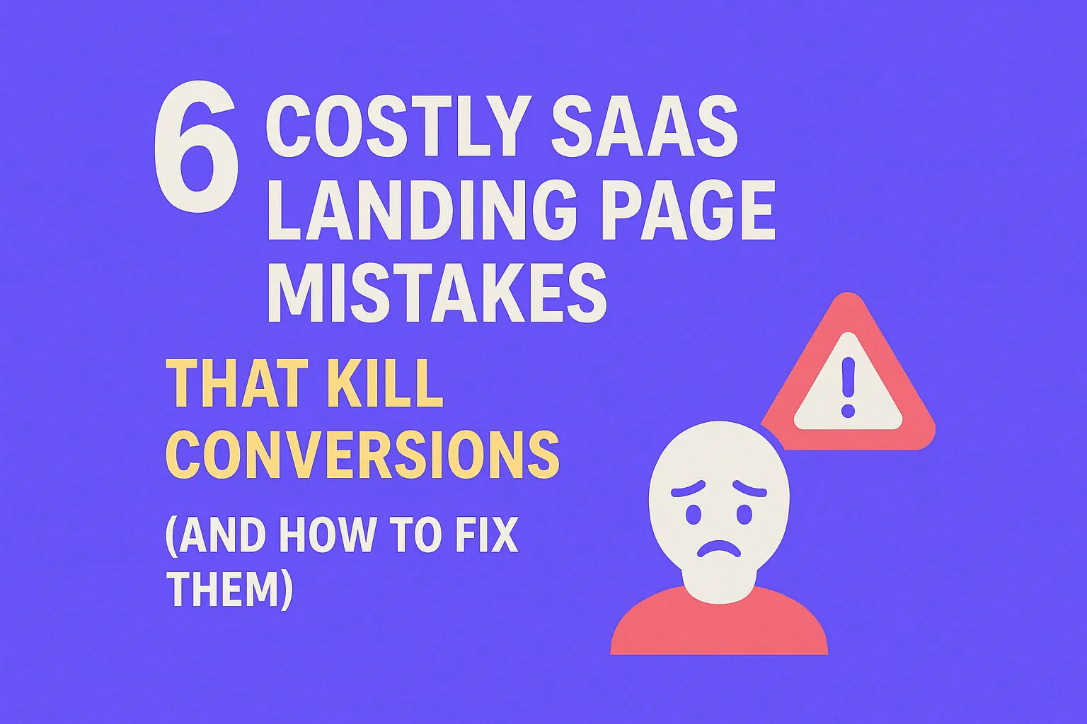
6 Costly SaaS Landing Page Mistakes That Kill Conversions (and How to Fix Them)
Written by
Andy Dao
,CEO
Published on:
August 15, 2025
Introduction
If you’re managing SaaS marketing, you already know landing pages can make or break your signup rates.
Yet, despite your traffic, conversions remain stubbornly low. Maybe the bounce rate is high, or visitors hesitate to hit that signup button. This frustration is common—and almost always tied to avoidable mistakes.
Why do many SaaS landing pages underperform? Because critical errors in design, messaging, and UX kill conversion momentum before users get to the offer.
The good news: optimizing SaaS landing pages is a data-driven process—not guesswork.
This article dives into the most common mistakes made by SaaS landing pages that hurt conversions, showing exactly what to fix and how. You’ll get clear, actionable insights to increase conversions, reduce bounce, and boost revenue fast.
Whether you’re a founder, marketer, or product lead handling your own site, these proven strategies will help you unlock your landing page’s true potential.
Understanding SaaS Landing Page Conversion Metrics
Key Metrics to Measure
Before fixing mistakes, you must know what to track:
- Click-Through Rate (CTR): Percentage of visitors clicking from landing page to signup or demo.
- Bounce Rate: Percentage leaving without engaging or clicking any element.
- Conversion Rate: Percentage completing desired action (signup, demo request).
How Poor Design and Content Affect Metrics
Landing page flaws distort these metrics dramatically. For example:
- Unclear messaging lowers CTR because visitors don’t understand value quickly.
- Overwhelming content spikes bounce rate as users get confused or frustrated.
- Weak CTAs directly reduce conversion rate, even if users stay on page.
Visual Benchmark: Conversion Impact by Mistake Type

Common SaaS landing page mistakes significantly impact conversion rates.
Typical SaaS landing page conversion benchmarks:
| Mistake | Average Conversion Rate |
|---|---|
| Clear Value Proposition | 15% - 25% |
| Weak/Missing Value Proposition | 3% - 7% |
| Content Overload | 5% - 9% |
| Poor CTA Placement | 4% - 8% |
| Ignoring Mobile Optimization | 2% - 6% |
| No Social Proof | 3% - 7% |
| Slow Loading Times | 2% - 5% |
Takeaway: Fixing landing page errors can multiply your conversion rate by 3x or more.
Mistake #1 - Lack of Clear Value Proposition
Why Clarity Beats Cleverness
Visitors decide to stay or leave within the first 5 seconds. If your headline and subheadline don’t clearly articulate how your SaaS solves their problem, you lose them.
Clever wordplay or jargon might sound smart but confuses visitors. The goal is instant understanding.
Real SaaS Landing Page Examples
Weak value prop example: “Revolutionizing your workflow paradigm.”
Strong value prop example: “Automate your team’s repetitive tasks and save 5+ hours/week.”
Step-by-Step Method to Clarify Your Value Proposition
- Identify your top benefit: What pain point do you solve most effectively?
- Quantify the outcome: How much time, money, or effort do users save?
- Use simple, direct language: Avoid jargon and buzzwords.
- Place it above the fold: Your headline and subheadline must be visible without scrolling.
Visual: Before/After Landing Page Screenshots

A clear, benefit-driven headline dramatically boosts landing page clarity and conversions.
Below are two SaaS landing page screenshots from a recent audit:
- Before: Vague headline, too many buzzwords, no tangible benefit.
- After: Clear, benefit-driven headline with supporting subheadline quantifying value.
(Screenshots would be inserted here.)
Pro Tip: Test your value prop by asking someone unfamiliar with your product what they understand after 5 seconds. If they hesitate, simplify.
Mistake #2 - Overwhelming Visitors with Too Much Information
How Cognitive Overload Kills Trust and Increases Bounce
Loading your landing page with walls of text, multiple CTAs, and excessive visuals triggers analysis paralysis.
Visitors doubt clarity and quickly exit rather than decipher complex information.
Data Case Study: Concise vs. Content-Heavy Pages
A/B testing of two SaaS landing pages showed:
- Concise page: 18% conversion rate
- Content-heavy page: 7% conversion rate
Source: SaaS growth agency internal data, 2024
Actionable Tips to Simplify Content and Design
- Use bullet points to break up information.
- Limit CTAs to one primary action above the fold.
- Remove distractions—minimalist layouts convert better.
- Use whitespace strategically to guide focus.
- Replace jargon with plain language.
Key takeaway: Less is more. Clear, scannable content beats verbose pages every time.
Mistake #3 - Ineffective Call to Action (CTA) Placement and Wording
Psychological Triggers Driving CTA Clicks
- Urgency: Words like “now” or “today” push immediate action.
- Benefit-focused language: “Start your free trial” beats “Submit.”
- Visual hierarchy: CTAs should stand out through color, size, and whitespace.
Heatmaps and Data-Driven Insights on CTA Placement
Heatmap studies reveal:
- Primary CTA should be above the fold and center/right-aligned for maximum visibility.
- Repeating a simplified CTA at the bottom captures long-scrolling visitors.
- Multiple competing CTAs reduce clicks on the main action by up to 20%.
(Insert heatmap visuals highlighting click hotspots here.)
Examples of Strong vs. Weak CTA Copy
- Weak: “Click here”
- Strong: “Start your 14-day free trial”
- Weak: “Submit”
- Strong: “Get instant access”
Step-by-Step Guide to Optimize CTA Design & Copy
- Use actionable verbs highlighting clear benefit.
- Select contrasting colors but aligned with brand.
- Place primary CTA near value prop.
- Limit to 1-2 CTAs per landing page.
- A/B test phrases and placement for your audience.
Pro tip: Include micro-copy below CTA buttons to address objections (eg. “No credit card required”).
Mistake #4 - Ignoring Mobile Optimization
Mobile Traffic Stats & Impact on Conversions
Over 60% of SaaS landing page traffic comes from mobile devices.
Yet many SaaS sites remain desktop-first and ignore mobile UX, causing skyrocketing bounce rates and low signup rates on phones.
Common Mobile UI/UX Flaws Hurting Signup Rates
- Small, hard-to-tap buttons
- Long forms requiring zoom and scroll
- Images and videos that slow loading
- Content clutter making scanning impossible
Practical Mobile Optimization Tips
- Use large, thumb-friendly CTAs.
- Simplify forms—ask for only essentials.
- Compress images and defer non-critical scripts.
- Test on multiple mobile devices and browsers.
- Enable fast-loading mobile layouts (AMP or responsive frameworks).
Bottom line: Mobile optimization is no longer optional—it's a conversion necessity.
Mistake #5 - Lack of Social Proof and Trust Signals
The Role of Testimonials, Reviews, and Certifications
Social proof builds trust within seconds and reduces hesitation around signups, especially for SaaS products where users invest time and data.
Trust signals include:
- Customer testimonials with real names and photos
- Industry-specific certifications or awards
- Trust badges (eg. GDPR, security compliance)
- Published case studies
Data Supporting Social Proof Impact
According to Nielsen, 92% of consumers trust recommendations from others, and SaaS landing pages with testimonials can see conversion lifts of up to 34%.
Easy Ways to Add Credibility Elements
- Feature 2-3 concise testimonials above the fold.
- Highlight recognizable logos of customers or partners.
- Include quantifiable results in social proof (“Increased revenue by 20% in 3 months”).
- Add certification logos near CTA to reinforce trust.
Mistake #6 - Slow Loading Times
Impact of Page Speed on Bounce and Retention
Google reports that 53% of mobile visitors leave a page taking longer than 3 seconds to load.
In SaaS, slow landing pages directly kill conversions by frustrating visitors before they experience your product.
SaaS-Specific Speed Optimization Tips
- Minimize JavaScript and CSS files.
- Use HTTP/2 and enable caching.
- Implement lazy loading for images/videos.
- Reduce third-party scripts (chat widgets, analytics).
- Host landing page on global CDN for faster delivery.
Recommended Tools for Testing Speed
Remember: Every 1-second improvement in load time can boost conversions by up to 7%.
Step-by-Step Checklist to Audit and Fix Your SaaS Landing Page
Comprehensive Actionable Checklist
| Category | Checklist Items |
|---|---|
| Content |
|
| Design & UX |
|
| Technical |
|
Case Study: Before & After Fixes
Scenario: SaaS startup X had a 5% conversion rate with a cluttered page, unclear value prop, and weak CTA.
After implementing fixes:
- Value prop rewritten for clarity
- Content simplified with bullet points
- CTA copy and placement optimized
- Mobile UX fixed
- Page speed improved via optimization
Result: Conversion rate jumped to 16% within 4 weeks.
Visual: Audit Template Screenshot
(Insert screenshot of a landing page audit checklist template here for reader use.)
FAQ: Common Questions on SaaS Landing Page Conversion Mistakes
Why do SaaS landing pages have low conversions?
Because many make critical UX and messaging mistakes—unclear value propositions, cognitive overload, weak CTAs, and slow loading, all of which reduce trust and engagement.
How many CTAs should a SaaS landing page have?
Generally, 1-2 CTAs is ideal. One primary CTA above the fold, and a secondary CTA near the bottom for longer scrollers. Multiple conflicting CTAs dilute clicks and hurt conversions.
What is the ideal length for a SaaS landing page?
There’s no strict rule: it depends on product complexity. But prioritize clarity and scannability. Use concise content with bullet points, and extend length only to answer user objections.
Can social proof really increase SaaS signups?
Absolutely. Testimonials, reviews, and trust badges increase credibility and reduce friction, boosting conversions by up to 30% according to industry studies.
How to effectively A/B test SaaS landing pages?
- Test one element at a time (headline, CTA, images).
- Use tools like Google Optimize, Optimizely, or VWO.
- Run tests until you have statistically significant results (1000+ visitors recommended).
- Iterate continuously based on data.
Conclusion and Final Takeaways
Common mistakes made by SaaS landing pages that hurt conversions are often simple to identify and fix.
Start with clarifying your value proposition, streamlining content, optimizing CTAs, and ensuring mobile and technical performance.
Adding social proof and improving page speed further boosts trust and retention.
Conversion rate optimization SaaS is a continuous process: Audit regularly, test methodically, and iterate relentlessly.
Now is the time to take these SaaS landing page best practices to heart and unlock higher conversions and growth for your business.
Implement these actionable tips today, measure your results, and watch your SaaS marketing funnel thrive.
Unlimited Design & Webflow Development
Get unlimited design & development requests for a flat monthly rate. Fast turnaround without compromising on quality. No contracts or surprises. Cancel anytime.