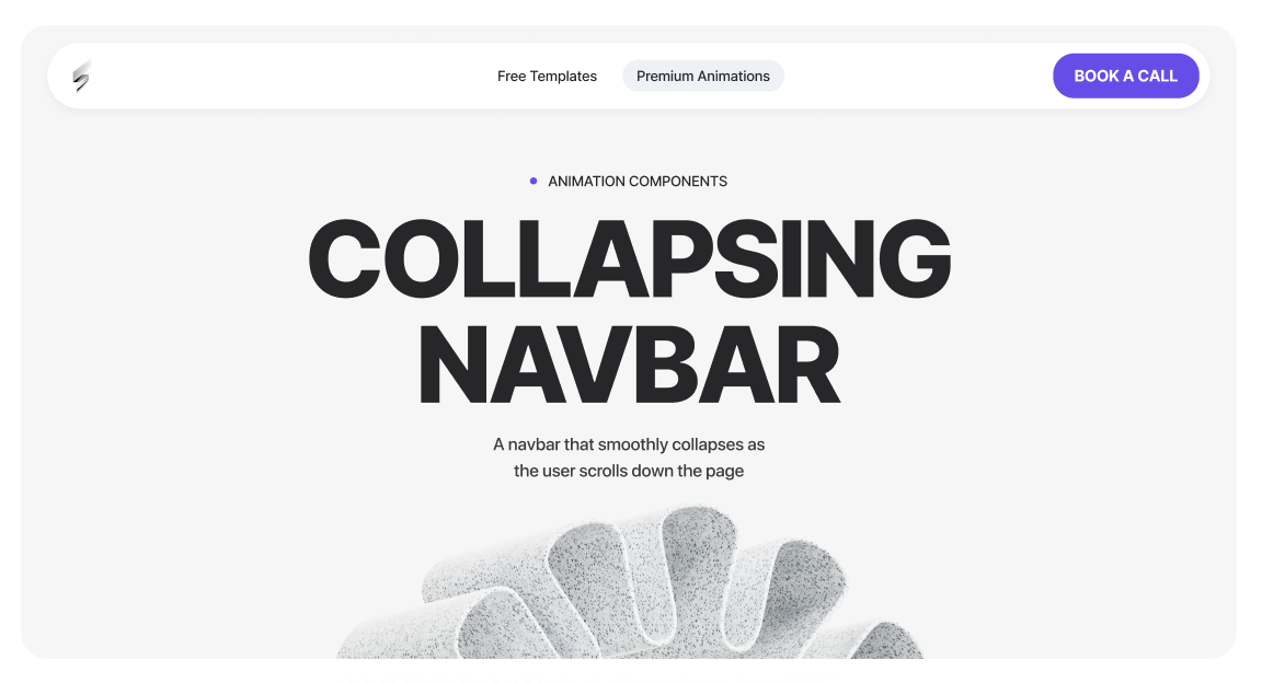
A navbar that smoothly collapses as the user scrolls down the page
<script src="https://cdnjs.cloudflare.com/ajax/libs/gsap/3.12.2/gsap.min.js"></script>
<script src="https://cdnjs.cloudflare.com/ajax/libs/gsap/3.12.2/ScrollTrigger.min.js"></script><script>
document.addEventListener("DOMContentLoaded", () => {
// Check if GSAP and ScrollTrigger are loaded
if (!window.gsap || !window.ScrollTrigger) return;
gsap.registerPlugin(ScrollTrigger);
// -------------------------
// SELECT ELEMENTS
// -------------------------
const navbar = document.querySelector("[navbar-container]"); // The navbar container
const bookText = document.querySelector("[book-text-hold]"); // The text inside the button
const arrowIcon = document.querySelector("[arrow-icon]"); // The arrow icon inside the button
if (!navbar) return; // Stop if navbar doesn't exist
// -------------------------
// INITIAL STYLES
// -------------------------
if (bookText) {
gsap.set(bookText, {
overflow: "hidden", // Hide content when width shrinks
whiteSpace: "nowrap", // Prevent text from wrapping
width: "auto", // Keep width dynamic
opacity: 1 // Ensure text is visible initially
});
}
if (arrowIcon) {
gsap.set(arrowIcon, {
display: "none", // Hidden initially
opacity: 0,
x: -6 // Slight slide from left
});
}
// -------------------------
// DESKTOP-ONLY ANIMATION
// -------------------------
ScrollTrigger.matchMedia({
// Desktop: min-width 992px
"(min-width: 992px)": function () {
// Create a timeline for the scroll animation
const tl = gsap.timeline({
scrollTrigger: {
trigger: document.body, // Trigger based on page scroll
start: "top -120px", // Start animation after scrolling 120px
toggleActions: "play reverse play reverse" // Play forward/backward on scroll
}
});
// -------------------------
// Navbar collapse
// -------------------------
tl.to(navbar, {
maxWidth: "50rem", // Collapse navbar width
duration: 0.65, // Duration of animation
ease: "power3.inOut" // Smooth easing
}, 0); // Start at beginning of timeline
// -------------------------
// Book text collapse
// -------------------------
if (bookText) {
tl.to(bookText, {
width: 0, // Shrink width to 0
opacity: 0, // Fade out
duration: 0.35, // Animation duration
ease: "power2.inOut" // Smooth easing
}, 0); // Start at beginning of timeline
}
// -------------------------
// Arrow icon appear
// -------------------------
if (arrowIcon) {
tl.set(arrowIcon, { display: "flex" }, 0.15) // Make arrow visible after small delay
.to(arrowIcon, {
opacity: 1, // Fade in
x: 0, // Slide to original position
duration: 0.35, // Animation duration
ease: "power2.inOut"
}, "<"); // "<" = start at the same time as previous set
}
// -------------------------
// CLEANUP ON RESIZE (leave desktop)
// -------------------------
return () => {
// Kill timeline and all ScrollTriggers for desktop
tl.kill();
ScrollTrigger.getAll().forEach(st => st.kill());
// Reset all elements to their original states
if (bookText) {
gsap.set(bookText, { width: "auto", opacity: 1 });
}
if (arrowIcon) {
gsap.set(arrowIcon, { display: "none", opacity: 0, x: -6 });
}
if (navbar) {
gsap.set(navbar, { maxWidth: "100%" });
}
};
},
// Tablet / Mobile: max-width 991px
"(max-width: 991px)": function () {
// Ensure everything resets to default
if (bookText) {
gsap.set(bookText, { width: "auto", opacity: 1 });
}
if (arrowIcon) {
gsap.set(arrowIcon, { display: "none", opacity: 0, x: -6 });
}
if (navbar) {
gsap.set(navbar, { maxWidth: "100%" });
}
}
});
});
</script>
Navbar Scroll Animation Guide
This script controls how the desktop navigation bar transitions into a compact state as the user scrolls down the page, and restores itself when the user scrolls back up or resizes the browser.
What this script controls
Desktop-only behavior
This animation only runs on desktop screens (992px and above).
On tablet and mobile:
When resizing between breakpoints, the script automatically cleans up and restores the correct state.
Attributes Breakdown & Behavior
[navbar-container]
Purpose:
Main navbar wrapper.
Behavior on scroll:
max-width: 100%)max-width: 50rem) after scrollingWhy this exists:
Creates a more compact, refined navigation layout once the user starts scrolling.
[nav-text-hold]
Purpose:
Holds the CTA button text (for example: “Book Now”).
Behavior on scroll:
0Important notes:
[arrow-icon]
Purpose:
Icon that replaces the button text in the collapsed navbar state.
Behavior on scroll:
Why this exists:
Maintains a clear CTA while keeping the navbar visually compact.
Customization tips
Join 1000+ developers getting weekly UI inspiration. No spam, ever.